Analyzing Demographic Trends
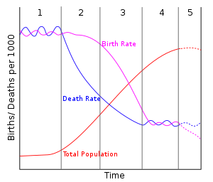

Next, the industrial stage is characterized by declining birth rates and steady death rates. Countries in this stage are developing businesses, economies, and expanding their global influence. Birth rates decline because women are entering the workforce and don’t see an excess of children as necessary (they are just economic burdens). Also, increased education/empowerment, birth control, and contraception cause rates to plummet. Health care is now a given, and people are living much longer due to modern medicine and having the money to pay for treatment. Many Latin American countries are in this stage because they are industrializing, but many citizens are poor and still have more children than the total fertility replacement of 2.1 children. Finally, the post-industrial stage has death and birth rates that are roughly equal; populations are stable, although they are much bigger than when the country in question was in the pre-industrial stage. Women have gained even more equality, and most people have more commercial wealth compared to the rest of the world. These countries (i.e. United States, most countries in Western Europe) usually consume far more energy than less developed nations and release more greenhouse gas emissions (an exception is Sweden). These countries also tend to dominate the global economy and hold more sway in international politics.
Many people have wondered what exactly prompted the demographic transition in developed countries, and why that method isn’t working in developing countries that are struggling. First, developed countries now had an abundance of natural resources that could be made into sellable products and shipped around the world. For example, coal, steel, and oil fueled the industrial revolution in the U.S. and England, while countries such as Haiti lack those resources. Second, the advent of AIDS has retarded the development of several countries in Africa; developed countries today never had a health challenge so large that it decimated millions of young, able-bodied workers. Finally, many developing countries receive routine aid and food relief from wealthier countries. Although these supports are certainly beneficial and save many lives, the giveaways are not prompting social development and the drive to create independent, innovative economies.
Finally, the study of population pyramids can help predict a country’s projected population growth. I analyzed graphs for different countries in 2015, 2045, and 2100. Some of the results for the 2015 and 2045 graphs were stunning, but I discovered that most countries’ graphs were stable/columnar by 2100 (graphs had the same width on the bottom as on the top). This indicates that most countries will undergo the demographic transition by 2100, which will help stabilize the exponential population growth overall. Although I knew that Zambia would have a wide base and narrow shaft for 2015 and 2045 (large number of babies with few adults that make it to old age), I was surprised at the United Arab Emirates graph. For 2015 and 2045, the proportion of young and middle age men was markedly higher than women; this points to infanticide and a cultural preference for dominant males rather than subservient women. I was also taken aback by Russia’s graph. Declining birth rates coupled with state of the art medical technology mean that their population is actually decreasing. The shaft on the bottom for babies/teenagers is much narrower than the proportion of middle age/elderly citizens. If every country were to reach this so-called “fifth stage,” the overall global population would decrease.

Sources:
http://populationpyramid.net/russian-federation/
AP Environmental Textbook

No comments:
Post a Comment