Mackenzie Patel
Hello world travelers! Everyone knows the Last Supper by da Vinci, but there have been thousands other worthy, but less known renditions as well. I would like to discuss three Renaissance Last Suppers (including the overrated one by Leonardo), and give my opinion on which one I think is the best (i.e. most masterful, interesting, and unique). The first Last Supper is obviously Leonardo’s, the second is a version by the Venetian master Tintoretto, and the third is actually not called “The Last Supper.” “Feast in the House of Levi” by Veronese depicts the Last Supper event, but due to the authoritative Catholic inquisition, he was forced to change the title of his giant masterpiece.
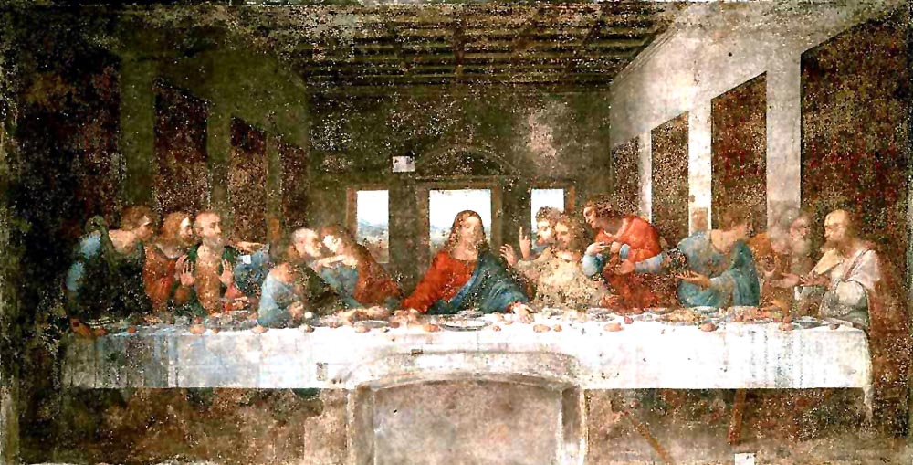
Da Vinci was a brilliant artist, but I personally believe he is overrated. There are many more talented and less trite Renaissance artists and works, but alas, those always get overlooked when da Vinci is mentioned. Leonardo is just the surface of a Renaissance crash course lesson, but there is a whole iceberg underneath. Noneless, his Last Supper is important because it is the most famous one in all of art history. The ideal faces, severe linear perspective, and triangular composition make this iconic image the archetype for 16th century art. It was painted from 1495 to 1498,and it currently hangs in the convent of Santa Maria delle Grazie (in Milan). This dry fresco with temperate paint has deteriorated greatly since its creation, and today, the dull colors are a shadow of what they once were during the early 1500s. Jesus’ head forms the central vanishing point, and the countryside visible through the window makes use of sfumato (haziness to suggest distance). The image basically screams “humanism” at the viewer because although the faces are ideal, they are more personalized and realistic than the flat, stylized faces that middle aged paintings contained. Symmetry is evident because there are exactly six apostles on either side of Jesus, who is the anchor and focal point in the whole 181 inch by 346 inch painting.

The next Renaissance/proto Baroque “Last Supper” was the one painted by Tintoretto in 1592. I say that this image is Proto-Baroque because of the swirling lines, intense colors, and overflowing drama. This oil on canvas is distinctly Venetian because of the bright pops of blue, red, and gold and the overt chiaroscuro (contrast of light and dark). The highly coffered ceiling and the table that plunges down the center of the room in a diagonal line completely skew the perspective. Straight lines and a perfectly central vanishing point have been ruthlessly abandoned, making this image more exciting to the eye. I particularly like the glowing light that permeates throughout the painting despite the dark interior. Jesus’ head lights up like a billboard in Las Vegas, and even his moving apostles have an ethereal radiance. On the whole, the painting seems like it is moving and “alive.” The billowing smoke that emanates from the dancing flame in the top left of the image transforms into dynamic angels that hover above the scene. The figures are elongated, flowing, and interact with not just each other, but with the viewer as well. This painting is fantastic because it combines the holy with the mundane, the evanescent with the quotidian. In the front center, Tintoretto included a still life in the fashion of the Dutch Baroque artists. A yellow-tinted maid is washing the dishes on the floor, there is a spotted dog snoozing by the feet of an Apostle, and a twisting man is plucking carefully rendered fruit from a table. This inclusion of everyday life is what changes the image from something untouchable and sacred to something that the common man would understand.

This last image is also rather fantastic because it shows Jesus partying it up with drunken Germans, court dwarves, and a man indiscriminately picking his teeth. To top it off, parrots, monkeys, and dogs litter the raucous scene as well. The painting I am referring to is “Feast in the House of Levi” by Veronese, another colorful Venetian artist of the late 1500s. It was painted in 1573 and was originally meant to be a Last Supper just like Leonardo’s or Tintoretto’s. However, the Catholic Inquisition thought it was too heretical and profane because it showed Jesus in the company of drunken gluttons who rather party than listen to Jesus blabbing on about God. Instead of completely changing this composition, Veronese cleverly changed the title to “Feast in the House of Levi.” This even actually occurred in the Bible, so he was let off the hook from the repressive Church officials. This wild scene is set inside a grand loggia framed by colossal triumphal arches. The symmetry and Classical influences are clearly Renaissance, but the bright colors and depiction of the everyday was distinctly Venetian. I particularly like the city depicted behind the revelers; it is a gleaming white marble paradise with Greek temples and a church. The perspective is more “normal” than the one in Tintoretto’s Last Supper, but the theatrical, exaggerated gestures make me feel like I am looking at a stage, not an interior Biblical scene. Overall, if I was to choose which Last Supper to take part in, I would hands down choose this one because I would be guaranteed to have a wild time.
In my opinion, I think Tintoretto’s Last Supper is the best out of the three. I boldly state this because Leonardo’s was too boring and Veronese’s too unconventional (mixing a debauched scene with an idyllic city backdrop didn’t mix well). Tintoretto’s perspective is incredible, tastefully rendered, and dramatic, while Leonardo’s and Veronese’s images felt more static and one-dimensional. I was also drawn to the colors in Tintoretto’s painting. They were vibrant without being obnoxious and as rich as a kinder chocolate from Switzerland.
See his work in the Ringling Museum in Sarasota here.
Images from Wikipedia.